Sunday, 16 November 2014

Œ Adventures - Part 2


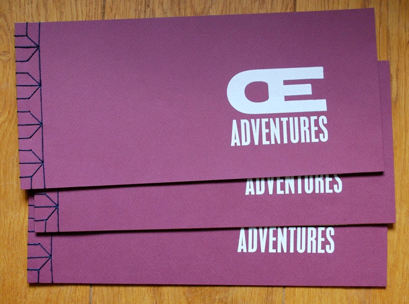
Some of the finished books

So here they are - three of the finished books. Having bought tiny quantities of zerkall ingres paper in various colours at various events over a period of about a year from John Purcell, it seemed sensible to finally put them to use! Up till now I have tended to go for value for money rather than quality when it comes to paper, but this project called for something different. Quality paper... mmmm. I love the smell of it, the feel of it and I definitely enjoy printing on it. Having each Œ adventure on a different coloured paper worked well, though presented a bit of a bookbinding conundrum. Fortunately the Japanese stab binding is perfect for this sort of situation.

"It started with an outbreak of jellyfish"

It started with an outbreak of jellyfish... it really did, as this was the first of the adventures. Having noticed that it's very helpful when impersonators declare who they are right at the beginning ("hello, my name is Michael Caine") I included a narrative with every page. For this I used 24pt Modern 20, a truly lovely typeface with all the character needed to carry this off. It also provided some consistency throughout the book.

Not too scary – the Œ ligatures as friendly ghosts

As the book was about the Œ ligatures becoming 'pictures of things' (Eric Gill would have been so disappointed), almost every part of the adventures was created using type as image. An exception to this was the linocut speech bubbles on the hallowe'en page - also the only page where the ligatures have something to say.

Things got rather sordid during The Game of Thrones.
The x-rated page...

Another departure from the text as image method was the blood spatter on The Game of Thrones page – possibly my favourite of the Œ adventures. The tv series is affectionately known as 'Swords and Bonking' in our house and this page could have gone either way. I played it safe!

Can you find the Œ ligatures?

The Œ ligatures play hide and seek: another potentially x-rated page, which makes this children's story book slightly less suitable for children than it might have been. Here the ligatures hide among latinised Greek words that used to be spelled with an Œ. Naturally they picked the more...er... colourful words to hide in. But at least I put gonorrhœa at the back, and what child doesn't find the word diarrhœa funny?

The last page... and the end of the adventures

All fun things have to come to an end and the space invaders provided a fitting conclusion. Unfortunately Zerkall don't make ingres paper in black so I had to use a thin paper from Cansford. But being at the back and with the Japanese stab binding, it works fine. The GAME OVER is put together using 6pt squares, 5 high, making a 30pt pixel type. 

This is a small selection of the nine adventures that the Œ ligatures enjoy in this book. The full narrative is as follows:

It started with an outbreak of jellyfish
Followed by high jinks at Hallowe'en
Things got rather sordid during The Game of Thrones
But they were flying high at the music festival
FIVE - FOUR - THREE - TWO - ONE...
Time for a sandcastle contest!
... and then a game of hide and seek
All too soon it was GAME OVER!

So why make this in the style of a children's book? There's no deep theory behind this as such, though perhaps there is a hint that being obsolete and out of date can free things up to be used in new and interesting ways, and that having a childlike (rather than childish) view of the world can be more fun than just following the rules.

I will have copies of the book available for sale at BABE, the Book Arts fair in Bristol in April 2015. There is also a copy at the bookartbookshop in London.


Sunday, 9 November 2014

Œ Adventures – Part 1

Book cover – the glimpses of orange are 
pieces of card, essential items in the correct 
letterspacing of uppercase letters ;)

Œ ligatures.... what can you do with them? They sit unused in the corners of typecases gathering dust, a physical reminder of changing typographic conventions. Decades ago they were used in latinised Greek words such as œdema, œstrogen and fœtid; now they only get an outing for French words such as hors d'œuvres or œuf. But it's impossible to throw them out. Being almost unused, they sit pristine with sharp edges hinting at the potential of beautiful clean prints in the future... if only they had a use.

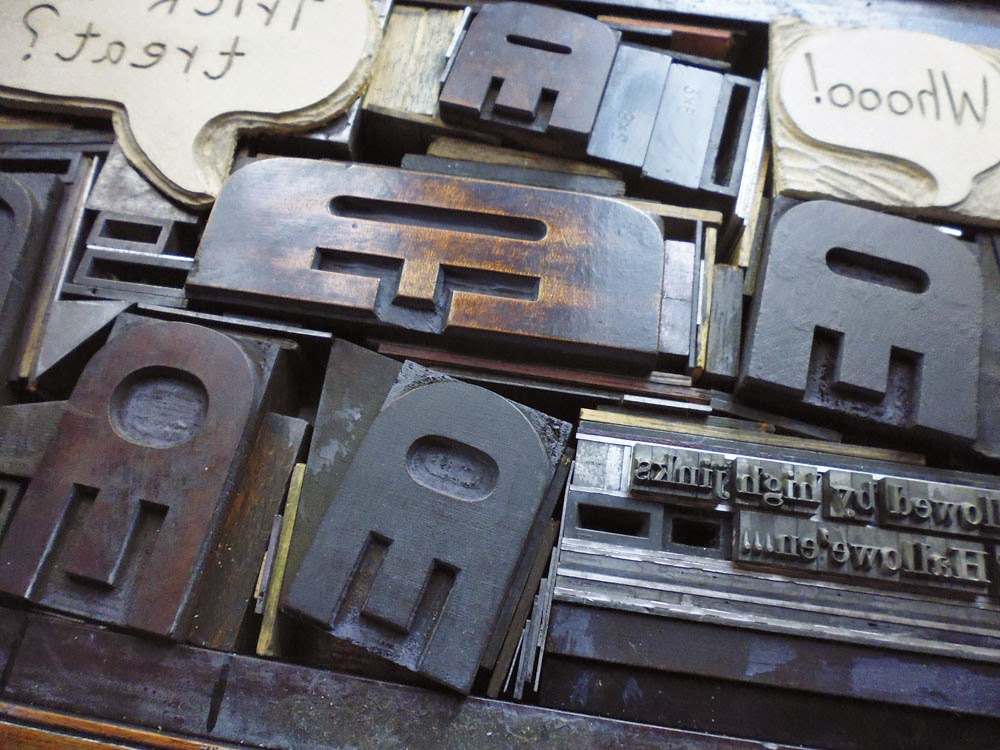
One day when sorting through some wood type I found two Œ ligatures turned round the wrong way, and suddenly they had transformed themselves into jellyfish. I hunted through the rest of my wood type and found four more wood type jellyfish... enough for a small shoal. Once the wavy wood rule was located, a quick print was inevitable. And once printed... there was a definite hint of space invaders. And printed on black, there they were... mutant space invaders.

This was just Sunday afternoon mucking about, until I showed them to fellow printers last August and suddenly this small experiment was being taken seriously. A book was suggested -- after all I had two pages designed already! The project appeared to take on a life of its own and ideas for other Œ adventures kept coming. The second crucial part of getting the project underway was being accepted to have a table at Counter Plymouth on 19 October. Now there was a deadline. This was important as otherwise I would still be agonising over the print quality of the first page.


Planning the hallowe'en page
Sometimes I set type direct on to the bed of the press. But more usually now I like to plan designs by cutting up proofs and shifting them around on the page. For the hallowe'en page (high jinks at hallowe'en) this created all kinds of hassles at the setting stage -- just as well I was doing this on a proof press. I wouldn't have even attempted it on a platen!


Arrgh! Call the forme police!
Some pages needed more planning than others. The hide and seek page (where the Œ ligatures hide among words) required a more translucent planning approach, so I proofed the words onto tracing paper. The ink never dried on the tracing paper, which was a complete pain, but I now store excess ink for future use in tightly sealed small packages made of tracing paper, which works better than any other method I've tried before....

Tracing paper proofs: sticky, but effective planning

I managed to finish printing the book (all sixteen copies!) by the deadline, and even bound the first six. More on the finished result in part 2... coming soon!


Sunday, 23 February 2014

An invitation from Alix and Francis Meynell

It's not everyday you discover a party invitation from a legendary couple... but if I'm completely honest, my first thought on finding this card hidden inside one of my grandmother's old books was "Mmmm, nice border!"


A party invitation from the Meynells

My second thought was: "Francis MEYNELL????" 

And eventually: "My grandparents went to a party hosted by Alix and Francis Meynell?" 

Francis Meynell wrote the foreword to the first edition of Printing for Pleasure by John Ryder. He was a poet, typographer, book designer and proprietor of the Nonesuch Press, which published beautifully designed and affordable books. John Ryder wrote that the press "...became equally well known for its standard of scholarship and for the typographical excellence of its books". 

Alix Meynell was one of the most senior civil servants in the UK - responsible for introducing the utility furniture scheme during the second world war - and a pioneer who "enlarged the possibilities open to women both in the public and private spheres" (The Guardian).

Although Nonesuch Press books were produced by commercial printers, Francis Meynell designed his books and printed ephemera on an Albion Press. I'd love to think that the wonderful border on this invitation was printed by him... but there's no way to know for sure.


From Introduction to Printing by Herbert Simon
By coincidence, a couple of months later I found a familiar looking border on page 82 of Herbert Simon's book Introduction to Printing - the Craft of Letterpress. This was the work of Bert E. Smith and shows all six monotype border elements that are needed to make the final design.

Incidentally I worked out that this party would have taken place sometime in the early 1970s. At the time my grandparents lived just round the corner from the Meynells, in Lavenham, Suffolk.