Sunday, 9 November 2014

Œ Adventures – Part 1

Book cover – the glimpses of orange are 
pieces of card, essential items in the correct 
letterspacing of uppercase letters ;)

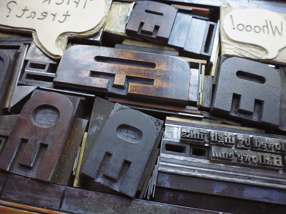
Œ ligatures.... what can you do with them? They sit unused in the corners of typecases gathering dust, a physical reminder of changing typographic conventions. Decades ago they were used in latinised Greek words such as œdema, œstrogen and fœtid; now they only get an outing for French words such as hors d'œuvres or œuf. But it's impossible to throw them out. Being almost unused, they sit pristine with sharp edges hinting at the potential of beautiful clean prints in the future... if only they had a use.

One day when sorting through some wood type I found two Œ ligatures turned round the wrong way, and suddenly they had transformed themselves into jellyfish. I hunted through the rest of my wood type and found four more wood type jellyfish... enough for a small shoal. Once the wavy wood rule was located, a quick print was inevitable. And once printed... there was a definite hint of space invaders. And printed on black, there they were... mutant space invaders.

This was just Sunday afternoon mucking about, until I showed them to fellow printers last August and suddenly this small experiment was being taken seriously. A book was suggested -- after all I had two pages designed already! The project appeared to take on a life of its own and ideas for other Œ adventures kept coming. The second crucial part of getting the project underway was being accepted to have a table at Counter Plymouth on 19 October. Now there was a deadline. This was important as otherwise I would still be agonising over the print quality of the first page.


Planning the hallowe'en page
Sometimes I set type direct on to the bed of the press. But more usually now I like to plan designs by cutting up proofs and shifting them around on the page. For the hallowe'en page (high jinks at hallowe'en) this created all kinds of hassles at the setting stage -- just as well I was doing this on a proof press. I wouldn't have even attempted it on a platen!


Arrgh! Call the forme police!
Some pages needed more planning than others. The hide and seek page (where the Œ ligatures hide among words) required a more translucent planning approach, so I proofed the words onto tracing paper. The ink never dried on the tracing paper, which was a complete pain, but I now store excess ink for future use in tightly sealed small packages made of tracing paper, which works better than any other method I've tried before....

Tracing paper proofs: sticky, but effective planning

I managed to finish printing the book (all sixteen copies!) by the deadline, and even bound the first six. More on the finished result in part 2... coming soon!


Sunday, 23 February 2014

An invitation from Alix and Francis Meynell

It's not everyday you discover a party invitation from a legendary couple... but if I'm completely honest, my first thought on finding this card hidden inside one of my grandmother's old books was "Mmmm, nice border!"


A party invitation from the Meynells

My second thought was: "Francis MEYNELL????" 

And eventually: "My grandparents went to a party hosted by Alix and Francis Meynell?" 

Francis Meynell wrote the foreword to the first edition of Printing for Pleasure by John Ryder. He was a poet, typographer, book designer and proprietor of the Nonesuch Press, which published beautifully designed and affordable books. John Ryder wrote that the press "...became equally well known for its standard of scholarship and for the typographical excellence of its books". 

Alix Meynell was one of the most senior civil servants in the UK - responsible for introducing the utility furniture scheme during the second world war - and a pioneer who "enlarged the possibilities open to women both in the public and private spheres" (The Guardian).

Although Nonesuch Press books were produced by commercial printers, Francis Meynell designed his books and printed ephemera on an Albion Press. I'd love to think that the wonderful border on this invitation was printed by him... but there's no way to know for sure.


From Introduction to Printing by Herbert Simon
By coincidence, a couple of months later I found a familiar looking border on page 82 of Herbert Simon's book Introduction to Printing - the Craft of Letterpress. This was the work of Bert E. Smith and shows all six monotype border elements that are needed to make the final design.

Incidentally I worked out that this party would have taken place sometime in the early 1970s. At the time my grandparents lived just round the corner from the Meynells, in Lavenham, Suffolk.


Monday, 13 May 2013

Hendrik Werkman – The Graphic Designer's Printer


Hendrik Werkman made his living as a commercial printer in Groningen, Holland, but is now remembered for his groundbreaking collaged artworks composed of type, rules, printing furniture and other objects, such as doorlocks. Many of the techniques employed by contemporary letterpress printers today – such as masking type, printing pictures of people from sorts, printing the back of woodtype – were pioneered by Werkman in the 1920s and 30s. He turned type into image, treated ink as though it was paint, loved paper textures and was delighted by the chance anomalies that occurred when all these variables came together.

H.N.Werkman, 'Plattegrond van de kunst en omstreken', uit Next Call nr.6, 1924, Groninger Museum

H.N.Werkman, 'Plattegrond van de kunst en omstreken', 
uit Next Call nr.6, 1924, Groninger Museum 


His experimental letterpress work began when he very nearly lost his printing business in 1923. He managed to retain just two of his 27 employees and moved the last of his type and equipment to a loft above a warehouse where he continued work as a jobbing printer. This event actually set him free – as he later wrote: “Like a wet poodle I shook off everything that for me was annoying”.

This was when he started making his ‘druksels’ (experimental prints or "printings") – short run or single prints – part traditional letterpress and part something else altogether! He put the paper on the bed of his 1850 German Dingler press, and placed pre-inked type and other printing materials on top: “I use an old hand press so […] the impression can be regulated instinctively. Sometimes you have to press hard, sometimes very lightly, sometimes one half of the block is heavily inked, the other half sparsely. Also by printing the first layer of ink on another sheet of paper you then get a paler shade, which is used for the definitive version… Sometimes a single print goes under the press fifty times”.

In September 1923, Werkman announced the launch of his new magazine – The Next Call – that he hoped would shake up the provincial members of the local art group De Ploeg, of which he was a member. It didn’t… but rather confirmed their pre-existing view of him as an eccentric. However, he exchanged copies for other leading avant-garde publications from all over the world.

Werkman was inspired by the avant-garde – Dada, Constructivism and De Stijl – but he wasn’t trying to change the world or impose a new typographic vision. In fact whereas other designers forced the letterpress process to achieve their designs, Werkman allowed the design to emerge from the process of printing: “Do you know the difference between me and the others? They are designers who do not work at a press and instead leave the production to others, while I produce designs during the course of printing.”

By the 1930s, Werkman was “hot printing” as he called it, ‘painting’ with rollers and using stencils and cut-outs. When Germany invaded the Netherlands and materials became scarce (every printer had to give up 200kg of metal type to make bullets) he worked with friends on a new subversive publication called De Blauwe Schuit (The Blue Barge) and two Chassidische legenden (Hasidic legends) portfolios. By this time there were almost no typographic elements in his work. In March 1945 he was arrested, probably for his sympathy towards the Jews, and his works were denounced as ‘Bolshevik art. He was executed by firing squad just a few days before Groningen was liberated by the Canadians.

H.N. Werkman, violist en publiek, 1942, Groninger Museum
H.N. Werkman, violist en publiek, 1942, Groninger Museum    


Hendrik Werkman has been enormously influential. Paul Rand was an early fan and Graham Wood of graphic design group Tomato wrote that The Next Call was as “vital and alive as any typography since, with more heart and soul than anything resembling it today.” But if it’s not your cup of tea, then you’re not alone. Richard Hollis describes his work as a “mockery of professional craft standards” and that “Werkman’s uninhibited graphic invention has been an inspiration to graphic designers anxious to introduce an obviously ‘creative’ effect”. It would certainly be easy to produce prints that rip off Werkman’s ideas. But remember that Werkman was able to print ‘properly’ – it was how he made his living, even if his heart wasn’t always in it. However, at a time when other designers were stressing the importance of ‘pure communication’ and functionalism, Werkman used letterpress techniques to show that playfulness is an essential part of design. Werkman was, as Herbert Spencer put it, “honest, simple, contemplative yet passionate – and above all, intensely human.”  

For further information see HN Werkman by Alston Purvis, published (2004) by Laurence King 

This article was written for Small Printer, the magazine of the British Printing Society.

Thursday, 4 April 2013

Printing for Pleasure, by John Ryder


Printing for Pleasure by John Ryder

Phrases from John Ryder’s Printing for Pleasure run through Small Printer like an inky sort of DNA – if, like me, you’re a fan of the book you’ll spot them cropping up at regular intervals throughout the year. I’m fairly sure that at least 80% of fellow members have either read the book or have it in their collection. Its continuing popularity shows that it’s so much more than “a primer on printing for the amateur”, so what is the book’s enduring appeal?


First of all, it really is the best introduction to letterpress printing for the beginner. Chapters 2 to 4 guide readers through the important early decisions – finding a suitable press and choosing type – and then how to compose and set type, inking and of course printing itself. John Ryder does all this in just 63 pages with a lightness of touch and a gentle humour. As Francis Meynell wrote in his foreword to the first issue, this is “reading for pleasure as well”.

Such brevity can only introduce printing techniques, though it is incredible how much ground John Ryder covers in these few pages. He introduces correct printing terminology, provides some historical context to the choice of typefaces, offers practical examples of setting type and even presents an introduction to typography with advice on letter-spacing capitals. At the same time he hints that there is so much more to find out and suggests other books for further reading. It’s a delicate balance that manages to enthuse readers without overwhelming them. He sets readers on the right path, and then pays them the compliment of believing that with the right attitude they will successfully make their own way forward.

These three chapters alone would make the book worth reading, but John Ryder does so much more. The twin themes of ‘pleasure’ and ‘experimentation’ run through the entire book and this, I believe, is what makes Printing for Pleasure so relevant to contemporary letterpress practice.

Rutt's Press: Pleasure or drudgery? From Printing for Pleasure by John Ryder
Rutt's press poses the problem: Pleasure or drudgery?

In the first chapter Pleasure as Profit John Ryder states that having the right attitude and the freedom to choose what you want to print is what makes printing a “pleasurable pastime” rather than “profit making drudgery”. By making pleasure rather than profit the driving force of the printing enterprise, the printer is freed up to experiment with design, inking, different papers, pressures… In fact John Ryder devotes an entire chapter to Developing a Taste for Experimentation, writing “it is here on the amateur’s workbench (a place from which the time-sheet and the wage-bill are absent) that experiments can be made and repeated without end and without fear of bankruptcy”.

Why this should be so important becomes clearer in the next two chapters, Sources of Inspiration and The Little Presses where the author shows that it is the printers of the private presses, not the commercial printers, who have the time, energy and freedom to promote quality in printing and engage in typographic investigation. This field of research, he believes, can “have a good influence on printing in general”. This is heady stuff! One minute you’re a letterpress beginner choosing your first typeface; four chapters later you’re part of printing history!

His introduction to the private press movement is full of fascinating fragments of history: Edmund Campion printing seditious texts (for which he was later beheaded), the nine year old Charles Daniel inking type with his thumb, and Cobden-Sanderson throwing the Doves punches and matrices into the River Thames. By following this with a chapter on Where to Buy Your Equipment the implicit message is that you too can be part of that movement. Sadly his lists are not as useful now as they would have been in the 1970s.

But where does this leave those who are printing for profit? Are they to be excluded? Not a bit of it! I don’t believe that John Ryder was anti-commerce. He was himself a distinguished book designer and exemplary typographer, and I am certain that it was the experimentation, research and the subsequent pleasure of working at his own private press that makes his work so great. The beautiful design and production of his book Printing for Pleasure is a lasting testament to that. What John Ryder does for all printers is to give them total freedom of the press… in every sense.

Notes: 
This article was originally written for the April 2013 issue of the British Printing Society's magazine Small Printer
The BPS library holds the 1969 reprint of the English Universities edition. My copy is the Bodley Head edition, extensively revised and redesigned by John Ryder in 1976. For more information on the history of the book and the various editions see Paul Moxon’s website: http://fameorshame.com/ryder/index.html

Monday, 18 March 2013

News Quote Number Two

Deregulate, Disaster, Shrug - Nick Doody, The Now Show

The second News Quote in the series (can I call it a series yet?) was delivered in splendid style by Nick Doody on The Now Show on BBC Radio 4. It follows on quite nicely from Billy Bragg's quote as he started with a rant on the horsemeat scandal, but then broadened it out to include "Suspiciously Cheap" clothes and flights and then on to the effects of deregulation -- or as he put it "Deregulate, Disaster, Shrug". It could be the food industry, but could equally apply to the financial industry and banks and...  

It was fun to have an excuse... no... a reason to use mixed type in this poster. It's not letterpress cuteness, it's not whimsey - it's deregulated typography. I may never have such a good opportunity again.

Surprisingly for such a simple design I tweaked the layout many times before printing the short run. This meant that the lock-up on the press is a little idiosyncratic, but nothing moved as I inked and printed, so it worked. 


Wood type on press bed


In case you are wondering, the three rules of printing News Quotes (I'm making this up as I go along) are that the quote needs to be printed fairly quickly after being said/written - or it's no longer news. (I am a bit late with this one as it was first broadcast on 8 March, but the episode is still just available on iPlayer.) Secondly, the quotes must all be printed on the same paper - 170gsm medium rough cartridge paper cut down to just fit on the press. Finally, the name of the person who said/wrote the quote must be included.

It's slightly concerning that both News Quotes so far have come from Radio 4. I may need to broaden my listening horizons.