Monday, 18 March 2013

News Quote Number Two

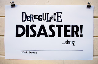
Deregulate, Disaster, Shrug - Nick Doody, The Now Show

The second News Quote in the series (can I call it a series yet?) was delivered in splendid style by Nick Doody on The Now Show on BBC Radio 4. It follows on quite nicely from Billy Bragg's quote as he started with a rant on the horsemeat scandal, but then broadened it out to include "Suspiciously Cheap" clothes and flights and then on to the effects of deregulation -- or as he put it "Deregulate, Disaster, Shrug". It could be the food industry, but could equally apply to the financial industry and banks and...  

It was fun to have an excuse... no... a reason to use mixed type in this poster. It's not letterpress cuteness, it's not whimsey - it's deregulated typography. I may never have such a good opportunity again.

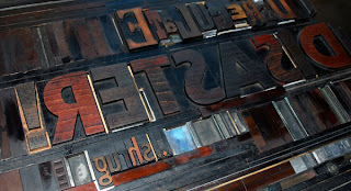
Surprisingly for such a simple design I tweaked the layout many times before printing the short run. This meant that the lock-up on the press is a little idiosyncratic, but nothing moved as I inked and printed, so it worked. 


Wood type on press bed


In case you are wondering, the three rules of printing News Quotes (I'm making this up as I go along) are that the quote needs to be printed fairly quickly after being said/written - or it's no longer news. (I am a bit late with this one as it was first broadcast on 8 March, but the episode is still just available on iPlayer.) Secondly, the quotes must all be printed on the same paper - 170gsm medium rough cartridge paper cut down to just fit on the press. Finally, the name of the person who said/wrote the quote must be included.

It's slightly concerning that both News Quotes so far have come from Radio 4. I may need to broaden my listening horizons.

Sunday, 17 March 2013

Press Marks

Every private press needs a press mark or device. It works a bit like a trademark (I'd rather not call it a logo) which is usually printed on the title page of any book produced by a private press.

Sorting out a press mark for Semple Press has been really difficult for some reason, but I think I'm making progress on this now. I was very inspired by the Letterpress: Something to Say conference in November 2012 at the St Bride Library, and since then my thoughts on what I want to do at Semple Press have become a bit more coherent. Having 'something to say' is part of the story, but Semple Press is also becoming part of my graphic design practice - a way to explore graphic design history and experiment away from the screen. It's also a place where I can find my own voice away from paid work. 

Using speech marks, or commas, or other pieces of actual type in the press mark seems to fit with this ethos, so last weekend I started messing with the punctuation.  


Press mark experimentation - wood type

I'll come clean here -- with the wooden type used above I only had two commas and two speechmarks and so after arranging them in pairs I printed a few copies then scanned and assembled these designs in photoshop. Is this allowed in letterpress circles? Don't care really; I was experimenting, not practicing my registration skills. The top two designs were made using commas, the rest with speechmarks. These worked so much better than I expected and I had forgotten that the negative space in the arrangements would have as much impact as the punctuation itself. What you can't see in the prints is the rest of the actual pieces of type, which is what dictates what you can and can't do to make this sort of pattern. This is why you end up with a completely different pattern with commas than you do with speechmarks. This is obvious now, less so when I started working on this!

Experimental press marks with wood and metal type

These marks were all made on the press bed. The tea cup is made up of wood type, as are the triangular commas next to it. The rest are made with commas from a metal typeface, Franklin Gothic 72pt. It gives a very different effect to the softer woodtype. 

There's definitely a press mark in here somewhere - or at least I'm on the right lines - but I need to live with them for a few days first.
Friday, 15 March 2013

Printing with Sandpaper

an eye for an eye makes the world go blind

Since last July I have been working on a Seven Deadly Sins book with my friend Mary. This is a joint project based very loosely on a college assignment I did in 2003, which focussed on the second Iraq War. This time round, we have decided to base it on neoliberalism, largely inspired by the film Four Horsemen

It's taking a bit longer than we intended, because I am supplying the linocut illustrations and I keep re-doing them or getting stuck into other projects. (I believe this may be called procrastination.) However, last weekend I made some progress on the Anger spread. 

A (small) part of this page is the famous "eye for an eye" quote from Gandhi printed on a textured background. The quote is set in 24pt Goudy Bold and was my first ever attempt at centred text (it's been hanging around for a while). The textured background is made up of two layers of ink. The first was a red, laid onto the paper with a roller. The second layer was a darker red and printed from a block made of sandpaper... meaning I stuck a really rough piece of sandpaper to a piece of plywood, then mounted the whole thing onto a block of wood to bring it type high. Sandpaper takes a lot of ink before it will print and it can't be applied to the block with a roller, so I had to use an old brush. Inevitably it then took a long time to dry before I could print the quote on top. In the time it took to dry, I learnt how to print the quote in the right place on the page, so the time wasn't wasted.


Gandhi quote

I printed the text using as little impression as possible - enough for the words to be readable but not so that it was visible on the back of the paper. Something I hadn't quite anticipated was how the textured background would work with the printed type. To be honest it's come out better than I expected and has fired me up to continue with the rest of the book. Unfortunately I am now aware that the more usual version of the quote is "an eye for an eye makes the whole world blind" so the temptation to do the whole thing again is very strong. Especially as I probably wouldn't centre the text another time and there are only eight good copies for a print run of seven. Dilemma.