Showing posts with label wood type. Show all posts

Sunday, 16 November 2014

Œ Adventures - Part 2


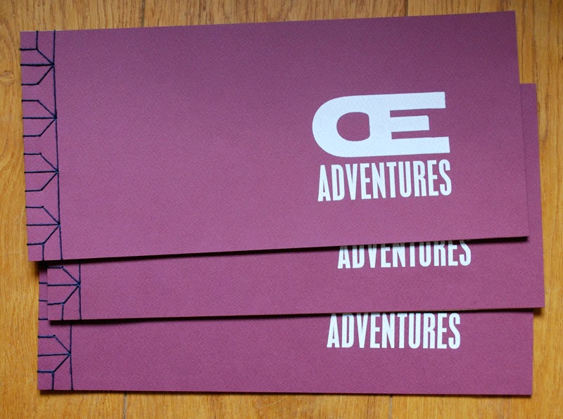
Some of the finished books

So here they are - three of the finished books. Having bought tiny quantities of zerkall ingres paper in various colours at various events over a period of about a year from John Purcell, it seemed sensible to finally put them to use! Up till now I have tended to go for value for money rather than quality when it comes to paper, but this project called for something different. Quality paper... mmmm. I love the smell of it, the feel of it and I definitely enjoy printing on it. Having each Œ adventure on a different coloured paper worked well, though presented a bit of a bookbinding conundrum. Fortunately the Japanese stab binding is perfect for this sort of situation.

"It started with an outbreak of jellyfish"

It started with an outbreak of jellyfish... it really did, as this was the first of the adventures. Having noticed that it's very helpful when impersonators declare who they are right at the beginning ("hello, my name is Michael Caine") I included a narrative with every page. For this I used 24pt Modern 20, a truly lovely typeface with all the character needed to carry this off. It also provided some consistency throughout the book.

Not too scary – the Œ ligatures as friendly ghosts

As the book was about the Œ ligatures becoming 'pictures of things' (Eric Gill would have been so disappointed), almost every part of the adventures was created using type as image. An exception to this was the linocut speech bubbles on the hallowe'en page - also the only page where the ligatures have something to say.

Things got rather sordid during The Game of Thrones.
The x-rated page...

Another departure from the text as image method was the blood spatter on The Game of Thrones page – possibly my favourite of the Œ adventures. The tv series is affectionately known as 'Swords and Bonking' in our house and this page could have gone either way. I played it safe!

Can you find the Œ ligatures?

The Œ ligatures play hide and seek: another potentially x-rated page, which makes this children's story book slightly less suitable for children than it might have been. Here the ligatures hide among latinised Greek words that used to be spelled with an Œ. Naturally they picked the more...er... colourful words to hide in. But at least I put gonorrhœa at the back, and what child doesn't find the word diarrhœa funny?

The last page... and the end of the adventures

All fun things have to come to an end and the space invaders provided a fitting conclusion. Unfortunately Zerkall don't make ingres paper in black so I had to use a thin paper from Cansford. But being at the back and with the Japanese stab binding, it works fine. The GAME OVER is put together using 6pt squares, 5 high, making a 30pt pixel type. 

This is a small selection of the nine adventures that the Œ ligatures enjoy in this book. The full narrative is as follows:

It started with an outbreak of jellyfish
Followed by high jinks at Hallowe'en
Things got rather sordid during The Game of Thrones
But they were flying high at the music festival
FIVE - FOUR - THREE - TWO - ONE...
Time for a sandcastle contest!
... and then a game of hide and seek
All too soon it was GAME OVER!

So why make this in the style of a children's book? There's no deep theory behind this as such, though perhaps there is a hint that being obsolete and out of date can free things up to be used in new and interesting ways, and that having a childlike (rather than childish) view of the world can be more fun than just following the rules.

I will have copies of the book available for sale at BABE, the Book Arts fair in Bristol in April 2015. There is also a copy at the bookartbookshop in London.


Sunday, 9 November 2014

Œ Adventures – Part 1

Book cover – the glimpses of orange are 
pieces of card, essential items in the correct 
letterspacing of uppercase letters ;)

Œ ligatures.... what can you do with them? They sit unused in the corners of typecases gathering dust, a physical reminder of changing typographic conventions. Decades ago they were used in latinised Greek words such as œdema, œstrogen and fœtid; now they only get an outing for French words such as hors d'œuvres or œuf. But it's impossible to throw them out. Being almost unused, they sit pristine with sharp edges hinting at the potential of beautiful clean prints in the future... if only they had a use.

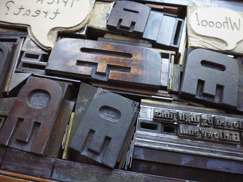
One day when sorting through some wood type I found two Œ ligatures turned round the wrong way, and suddenly they had transformed themselves into jellyfish. I hunted through the rest of my wood type and found four more wood type jellyfish... enough for a small shoal. Once the wavy wood rule was located, a quick print was inevitable. And once printed... there was a definite hint of space invaders. And printed on black, there they were... mutant space invaders.

This was just Sunday afternoon mucking about, until I showed them to fellow printers last August and suddenly this small experiment was being taken seriously. A book was suggested -- after all I had two pages designed already! The project appeared to take on a life of its own and ideas for other Œ adventures kept coming. The second crucial part of getting the project underway was being accepted to have a table at Counter Plymouth on 19 October. Now there was a deadline. This was important as otherwise I would still be agonising over the print quality of the first page.


Planning the hallowe'en page
Sometimes I set type direct on to the bed of the press. But more usually now I like to plan designs by cutting up proofs and shifting them around on the page. For the hallowe'en page (high jinks at hallowe'en) this created all kinds of hassles at the setting stage -- just as well I was doing this on a proof press. I wouldn't have even attempted it on a platen!


Arrgh! Call the forme police!
Some pages needed more planning than others. The hide and seek page (where the Œ ligatures hide among words) required a more translucent planning approach, so I proofed the words onto tracing paper. The ink never dried on the tracing paper, which was a complete pain, but I now store excess ink for future use in tightly sealed small packages made of tracing paper, which works better than any other method I've tried before....

Tracing paper proofs: sticky, but effective planning

I managed to finish printing the book (all sixteen copies!) by the deadline, and even bound the first six. More on the finished result in part 2... coming soon!


Monday, 18 March 2013

News Quote Number Two

Deregulate, Disaster, Shrug - Nick Doody, The Now Show

The second News Quote in the series (can I call it a series yet?) was delivered in splendid style by Nick Doody on The Now Show on BBC Radio 4. It follows on quite nicely from Billy Bragg's quote as he started with a rant on the horsemeat scandal, but then broadened it out to include "Suspiciously Cheap" clothes and flights and then on to the effects of deregulation -- or as he put it "Deregulate, Disaster, Shrug". It could be the food industry, but could equally apply to the financial industry and banks and...  

It was fun to have an excuse... no... a reason to use mixed type in this poster. It's not letterpress cuteness, it's not whimsey - it's deregulated typography. I may never have such a good opportunity again.

Surprisingly for such a simple design I tweaked the layout many times before printing the short run. This meant that the lock-up on the press is a little idiosyncratic, but nothing moved as I inked and printed, so it worked. 


Wood type on press bed


In case you are wondering, the three rules of printing News Quotes (I'm making this up as I go along) are that the quote needs to be printed fairly quickly after being said/written - or it's no longer news. (I am a bit late with this one as it was first broadcast on 8 March, but the episode is still just available on iPlayer.) Secondly, the quotes must all be printed on the same paper - 170gsm medium rough cartridge paper cut down to just fit on the press. Finally, the name of the person who said/wrote the quote must be included.

It's slightly concerning that both News Quotes so far have come from Radio 4. I may need to broaden my listening horizons.

Wednesday, 27 February 2013

News Quote Number One

Wood type poster, If you leave everything to the market you get horsemeat, Billy Bragg

Billy Bragg was on BBC Radio 4's Saturday Live last weekend being his usual ebullient self. During a discussion about the UK's strange bias towards people with a privileged background in all walks of life from the front benches of parliament to smug public school boys "clogging up the charts", it was suggested that maybe it was ok to let the market decide what should be in the charts... To which Billy Bragg immediately responded "If you leave everything to the market you get horsemeat in your burgers". Brilliant.

Having recently acquired two newsy looking sets of 20 line type - one very condensed and one slightly less condensed - it occurred to me that Billy's response was an excellent excuse to print a letterpress poster. I set the wood type straight onto the bed of the press that very afternoon, mixing letters from both to keep it within the bounds of the paper and because I didn't have quite enough letters to print it using one set. The wood type isn't in the best shape so needed a fair bit of make-ready, but the point was to print the quote the same day. 


Wood type


I printed it on a medium rough cartridge paper (170 gsm) and the final effort looks a bit like one of the pavement board posters you see outside newsagents. The quote weirdly seems to gain significance by being made into a poster...

There's a very established trend now for letterpress printers to print quotes of the Keep Calm and Carry On variety, and even the most banal piece of fridge magnet wisdom can take on the veneer of credibility when turned into a letterpress poster. Fortunately, there's also some great work from printers like gridula or The Counter Press which provides hope (and a laugh) and work from Meat Collective makes my head spin it's just so good. To get me started however, there's definitely scope for a series of posters of 'News Quotes' or 'News Comments' -- the kind of comment that just sums up a particular story, or has you screaming at the radio, or makes you laugh. A News Quote poster series could provide an interesting take on the news over a period of time... or it might just reveal my own political bias in 3 inch type. I'm willing to take that risk and am now listening out for suitable quotes for new posters -- let me know if you hear any.

Thursday, 3 January 2013

Wood Type Poster

... masquerading as wrapping paper

wood type

On the Friday before Christmas, when I should have been tidying the house, putting up decorations, chained to the stove (insert Christmas blah here) I was actually printing wood type in the print shed. But it was ok because I was printing wrapping paper... or that was my story anyway.

The idea was to assemble some nice examples from my various sets of wood type, including some tasty individual letters picked up at markets and second hand shops, in a random arrangement and make a large poster. 

I absolutely love wood type - it has a tactile, strokeable quality that lead type simply doesn't have. However it really is a world of pain to print, because being made of wood it expands and contracts. And if you print type from different sets you're sure to have a lot of work to do to make it all the same height. I knew this which is why I bought lots of sugar paper (12p a sheet - bargain!) so that as I worked with the type to bring it up to type high, I could turn the waste prints into wrapping paper.

Wood type print

"Phwoar! Look at the wood grain on that!" This was obviously my first reaction to the first print. Followed by surprise at just how invisible some of the letters were compared to others. To a non-printing person this looks rather nice -- though to a printer just looks like bad printing! I discovered why there was quite such a difference when I measured some of the letters using a micrometer. They ranged in height from 0.903" to 0.934", when as Any Fule Kno they should be 0.918". Although it doesn't sound much it really does make all the difference.

Micrometer showing 0.918" - type high

It did occur to me to sand down the backs of the tallest ones to make them match the rest... no, just kidding! The only way to get all the letters type high was to print a sheet to find the light letters, then unlock the type and raise up the offending letters with sheets of paper of various thicknesses and thinnesses and then print again... and then go through all that again and again and again until it looked right. (If any readers know an easier way to do this, please do make a comment!)

The type on the bed ended up looking like this:

Wood type on press bed


And the grim reality of working with wood type, aka the mess I created, looked like this (I did clear everything away before making the next print):

The grim reality of working with wood type

It could have been a chore, but it wasn't because 6Music was playing and I dropped into a sort of meditative daze. Quite pleasant.

I ended up with loads of wrapping paper, which satisfyingly looked like this:

Wrapping paper

You can spot the later prints as they are the ones where all the letters print at more or less the same strength.

However, ironically my friends and family actually preferred the paper where some letters printed really well and some badly. Nicer contrast apparently!