Taking it One Step at a Time (part 2)
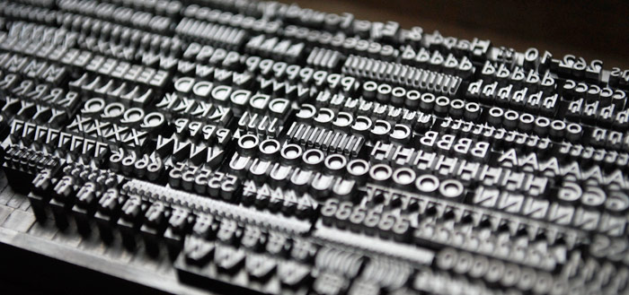
The new type from Hand and Eye foundry arrived much quicker than expected. It came wrapped in large quantities of brown paper and bubble wrap, which took ages to carefully undo. New type is surprisingly shiny and I tried and failed to prevent myself from going into Gollum impressions "My preciousssssssss". It's ok, there was no-one to see...I typeset Mary's business card again, taking the opportunity to tweak the design - a little less leading there, a little more there, a different kind of rule, putting Mary's name in 12pt rather than 10pt - and inked up the press again ready to try the first print with the new type.
But before I did that I made absolutely sure that the Adana was set to minimum impression because I want this new type to last as long as possible.
It was a bit nerve-wracking to try that first print because at the back of my mind I was worried that the problem hadn't been with the type at all... but the very first print was immediately so much better than the best of my previous attempts and it all suddenly seemed... easy. The letters were crisp and clear and the commas looked like commas rather than squashed midges.

Printing the cards after that was relatively straightforward, though there was a nasty moment when it looked as though the left hand edge was wonky even when the bottom edge was straight. Took a while to realise that the cards had not been cut straight, so I will be trying a different supplier in future. Though ultimately it would be much better to cut them myself. This discovery meant that each and every card had to be checked for a square edge before printing. One day this will all seem hilarious.
So what have I learned?
1. Never buy second hand type without checking it with a magnifying glass2. Don't bother to buy second hand type in smaller sizes unless it's very unusual, or you know the previous owner treated it properly
Although I suspect this whole episode reads like a nightmare, it's actually been an enjoyable experience. Really! It's been very satisfying to figure out, step by step, why things aren't working and to gradually put them right. Printing is a mechanical and logical process and it just takes a bit of time to get it right. Unfortunately it just takes me ages to get it right! I'm hoping that once I move on from 'letterpress beginner' to 'letterpress intermediate' the process might get a little quicker.
Finally I have been trying to work out how the previous owner of that second hand type let it get into such a terrible state. Did he/she really throw it across his/her workshop and stamp on it? Or were the typemice busy? Or perhaps that's just how type gets after a long and useful life. It should really be destined for the hellbox so it can go back to the founders to be made into more new shiny type... But Gordon Chesterman's idea of setting worn type in resin for further creative experimentation suggests there might be a little more life in it yet.
Major improvement in the business cards, though the squashed midge look may have some use for the news quotes.
ReplyDeleteThanks for your comment. I learned a lot doing these cards, and the improvement wasn't just down to the type! The good news is that Mary is really happy with them.
ReplyDelete